
Second year Katie Makepeace shoots work for the Editorial Photography with Moving Image module
24th January 2022
The story behind my zine started with the initial idea of exploring my specialisation further; I really wanted to expand on my love of photographing landscapes while including other elements. This was because, I really enjoyed the collaboration of furniture and landscapes last year; however I didn’t want to repeat myself. The collaboration between students in this project was a blessing in disguise in my opinion, as the specialisms of myself and my partner (Chris, focusing on automotive photography) instantly gave us an area to focus on within the moving image part of the brief.
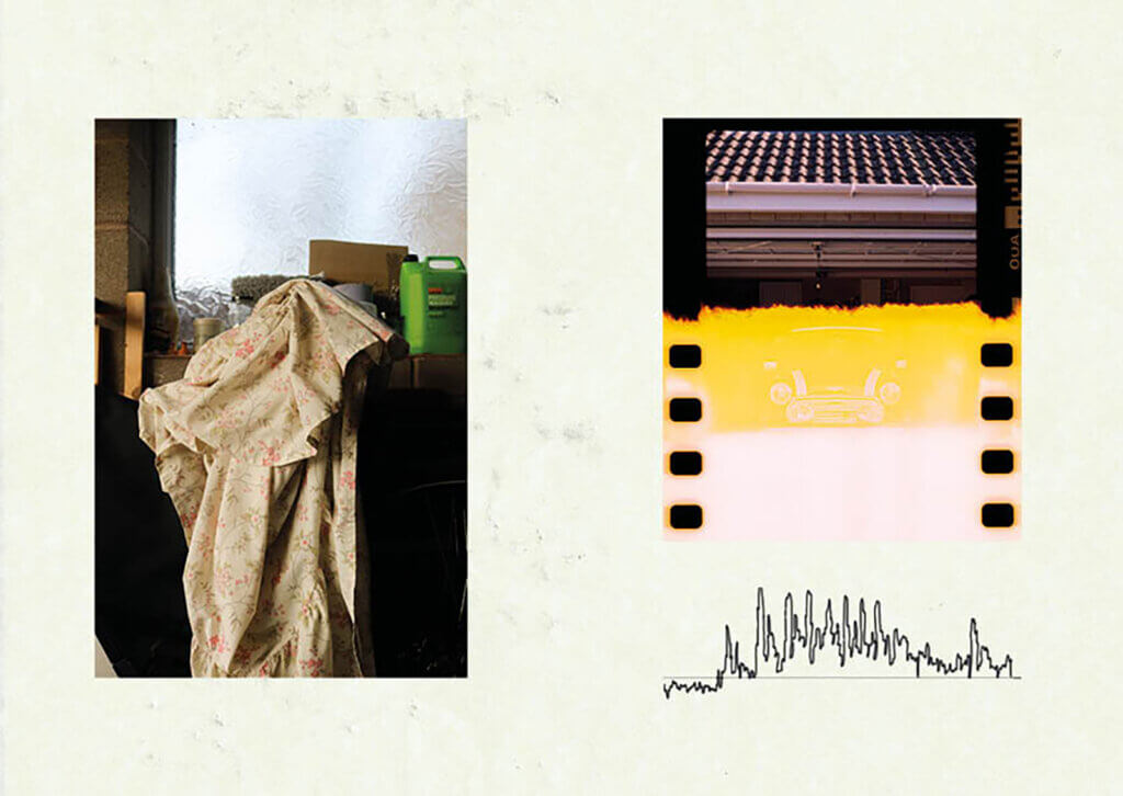


We both feel inspired by old classic and vintage cars for different reasons, but agreed on the fact they should be kept on the road, which gave us a narrative for our moving image. So, for my zine, it was about creating a personal document while focusing on some of the design elements of the car style to involve my design/interior specialisation too. To achieve this: adding in the illustrations, scanned tyre marked pages and linking the story together with documentation photos and detailed shots of the classic design elements of NOA the mini. During this project I grew an ever-stronger connection to classics and cars in general.

Within this project of Editorial photography, I also chose the brief to produce a music album sleeve cover and promotional video, due to my interest in music and design. After contemplating the song to choose for this brief I settled on a more modern song that resonated with me, that had an existing cover I felt didn’t represent the album in the best way. This then inspired me to challenge myself to represent the song/album in a much better way- the song being: ‘West Coast Love’ by Emotional Oranges. It was important to me to create a simplistic, yet interesting design and film, using the focus point of the beach/the west coast, making both of my final pieces true to the lyrics. The title of the song split itself into 3 sections in my mind, helping me to create a 3 leafed album cover design and sticking to this idea of thirds within the imagery. The moving image was move about a hint to experiencing the lyrics within the song, ultimately showing what they portray.